7 Must-Try Gallery Wall Layouts for Every Room
Many people want to showcase their personality and memories through a photo gallery wall but feel uncertain about where to begin. Questions about arrangement, concerns about making too many holes, and doubts about achieving a professional look can stop even enthusiastic decorators in their tracks.
Fortunately, these seven proven gallery layouts offer solutions that work beautifully in different spaces, helping anyone create a wall display they’ll love.
1. The Classic Grid Formation
The grid layout provides an excellent starting point for anyone feeling overwhelmed by too many options. This arrangement solves the most common gallery wall challenge: creating a sense of order and intentionality. With consistent spacing and alignment, even diverse photo collections appear polished and purposeful.
Measuring and Spacing Tips
Starting with wall measurements and working backward helps ensure proper fit. Many decorators recommend the “three-inch rule” – maintaining approximately three inches between frames creates adequate breathing room without making the collection feel disconnected. For a foolproof approach, cutting paper templates of each frame and taping them to the wall first can prevent unnecessary wall damage.
Creating perfect spacing becomes easier with a level and painter’s tape to establish a temporary grid on the wall. Marking where each frame will hang, then stepping back to view from different angles before committing, helps ensure satisfaction with the final result.
Frame Size Selection
Consistency remains key for grid layouts. Identical frames create the most classic look, while frames of the same color with varying border widths add subtle interest. When displaying photos with different orientations, cropping them to fit uniform frames works better than mixing frame sizes.
One important lesson experienced decorators share: calculate the total width and height before purchasing frames. This prevents the disappointment of discovering a carefully planned grid won’t fit the available space.
Perfect for: Home Office and Living Rooms
The orderly nature of grid layouts works beautifully in spaces where professionalism and calm are desired. In home offices, a grid of inspirational images or achievements creates focus without distraction. In living rooms, a grid above the sofa anchors the seating area and establishes a focal point without overwhelming the space.
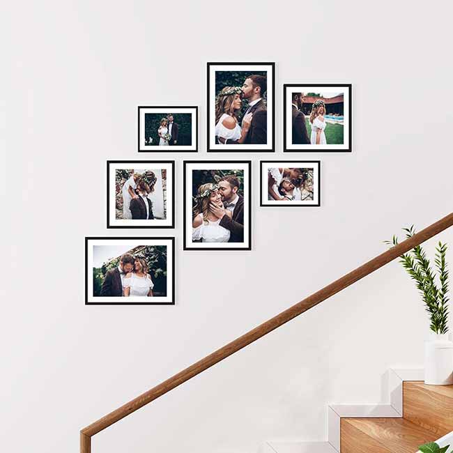
2. Organic Scattered Layout
Many homeowners fear asymmetry, worried their gallery will appear haphazard rather than artfully random. The organic scattered layout embraces controlled chaos, creating visual interest while maintaining intentionality.
Starting from the Center
The secret to a successful scattered layout lies in establishing a clear focal point. Selecting a favorite or largest piece and positioning it slightly off-center creates an anchor. From there, building outward in a loosely radiating pattern helps maintain balance.
A helpful technique involves placing pieces on the floor first, taking a photo, and studying the composition before hanging anything. This bird’s-eye view reveals balance issues that might not be obvious when standing close to the wall.
Mixing Frame Sizes
The beauty of scattered layouts comes from the freedom to mix frame sizes and styles. Limiting the color palette creates cohesion – perhaps all black frames, all white, or natural woods. Within that constraint, shapes and sizes can vary freely.
A useful rule of thumb: keeping smaller pieces toward the center and larger pieces toward the edges creates a layout that feels like it’s gently expanding outward.
Perfect for: Family Rooms and Staircases
Scattered layouts work wonderfully in high-traffic family spaces where the casual, evolving feel matches everyday life. They’re also ideal for staircases, where they can follow the diagonal line while maintaining visual interest. The organic nature feels welcoming and suggests a home where memories are treasured but perfection isn’t the goal.
3. Vertical Column Design
For narrow spaces with limited wall width, the vertical column design offers an excellent solution, making the most of height while requiring minimal horizontal space.
Height Considerations
For vertical columns, considering sight-lines helps with placement. Images meant to be highlighted work best at eye level (typically 57-60 inches from the floor to the center of the piece). With particularly high ceilings, a column that stops a foot or two below often looks more intentional than one stretching all the way up.
When hanging multiple columns, using a plumb line ensures they’re perfectly straight. Even slight misalignments become obvious in vertical arrangements.
Spacing Between Frames
Vertical columns generally benefit from tighter spacing than other layouts – usually 1.5 to 2 inches between frames. This creates a more cohesive column that reads as a single unit rather than separate pieces. When hanging multiple columns side by side, keeping the spacing between columns about twice the spacing between frames within each column creates visual harmony.
Perfect for: Hallways and Small Spaces
Narrow hallways, spaces between windows, or awkward walls next to doorways – vertical columns transform these challenging areas into gallery opportunities. They draw the eye upward, creating the illusion of height in small spaces. Many homeowners use vertical columns in entryways to create impact in otherwise forgettable transitional spaces.
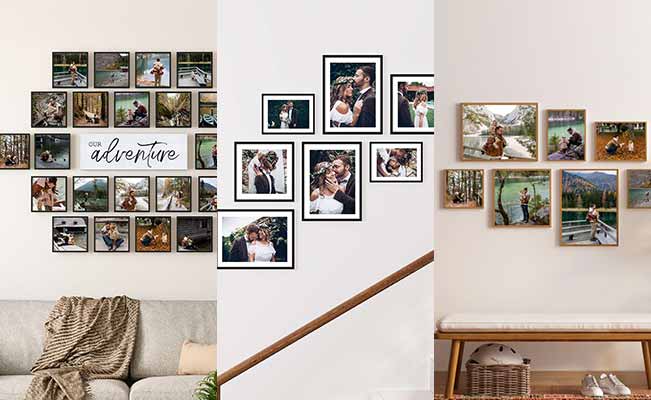
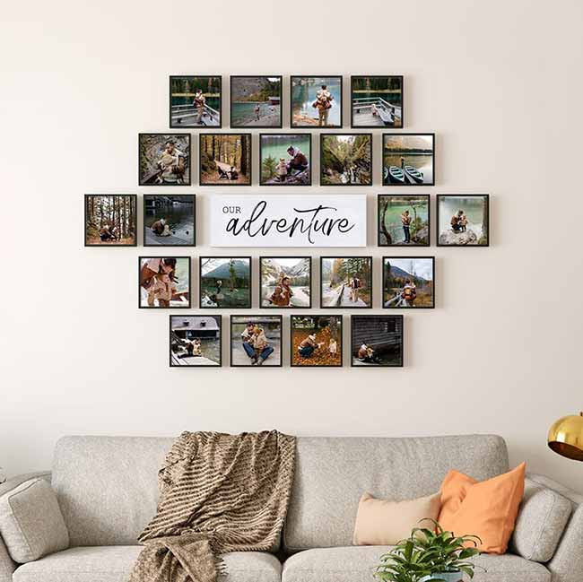
4. Salon-Style Gallery
When someone wants to display an extensive art collection without creating a cluttered appearance, the salon-style gallery offers a solution – a deliberate abundance that celebrates collection and curation.
Mixing Art Types
The salon style embraces variety – photographs alongside paintings, prints next to textiles. The key is finding a unifying element, whether that’s a color theme, similar subject matter, or complementary frames.
Creating “neighborhoods” within a salon wall – small clusters of related pieces that form mini-stories within the larger narrative – provides visual entry points for viewers rather than overwhelming them with unrelated images.
Creating Visual Balance
Despite its seemingly random appearance, a successful salon wall requires careful balance. Distributing dark and light pieces, large and small frames, and colorful and neutral works evenly throughout the display creates harmony. Stepping back frequently during installation helps assess the overall effect.
For salon walls, starting with larger anchor pieces positioned asymmetrically, then filling in with medium and small works creates structure. The largest pieces should form a loose triangle across the composition to guide the eye around the display.
Perfect for: Living Rooms and Master Bedrooms
Salon galleries make powerful statements in spaces where people spend significant time. In living rooms, they become conversation starters. In master bedrooms, they surround occupants with meaningful images and objects that bring joy. The immersive quality of a salon wall creates a sense of being enveloped by memories and inspiration.
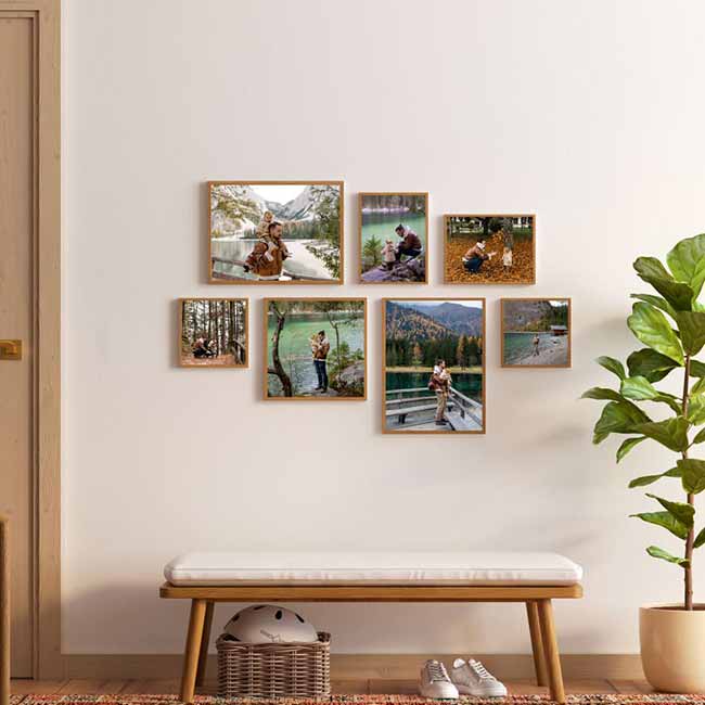
5. Geometric Pattern Layout
For those who find traditional galleries too predictable but want more structure than scattered arrangements, geometric patterns offer a fresh approach. These layouts satisfy both creative and orderly instincts.
Creating Hexagonal Arrangements
Hexagonal layouts create a honeycomb effect that feels both organic and structured. Starting with a central hexagon and building outward, adding frames at each “point” of the hexagon creates a naturally expanding pattern that can grow in any direction.
For precise hexagons, using a paper template with 60-degree angles marked ensures each frame connects properly to create true hexagonal shapes rather than irregular polygons.
Triangle Formations
Triangle arrangements create dynamic energy and can make clever use of awkward wall spaces. A cascading triangle that starts with a single frame at the top and expands downward, or an inverted triangle that anchors a space with its widest part at the top, offers interesting variations.
The trick with triangular arrangements is maintaining equal spacing between frames while still adhering to the overall triangular shape. A tape measure and level to mark points at equal distances before hanging helps achieve precision.
Perfect for: Modern Homes and Creative Spaces
Geometric layouts complement modern architecture and furniture beautifully. They work especially well in creative spaces like home studios, craft rooms, or children’s play areas, where the unexpected pattern stimulates imagination while maintaining visual order.
6. Story-Line Layout
Some collections aren’t just about aesthetics – they’re about narrative. The story-line layout arranges images in ways that tell a sequential story, perfect for life’s journeys and milestones.
Timeline Arrangements
Horizontal timelines work beautifully for displaying chronological events – a child’s growth, a relationship’s development, or travel adventures. A thin piece of wood or decorative rope running behind the frames can visually connect the pieces and emphasize the timeline concept.
For longer timelines, a “wraparound” approach that turns corners and continues on adjacent walls creates an immersive storytelling experience as viewers physically move through the narrative.
Photo Selection Tips
When creating narrative displays, consistency becomes even more important. Photos with similar lighting, color treatment, and composition create a cohesive story. For milestone timelines, images that clearly show progression or change make the narrative more compelling – the more dramatic the visual difference between “before” and “after,” the stronger the impact.
Including brief captions or dates with timeline displays adds context. Small cards mounted below each frame or discreet labels provide information without distracting from the images themselves.
Perfect for: Children’s Rooms and Memory Walls
Timeline layouts work wonderfully in spaces dedicated to personal history. In children’s rooms, a growth timeline creates a sense of pride and identity. In family spaces, anniversary timelines or vacation sequences preserve cherished memories while creating an evolving family story that can grow over time.
7. The Mixtiles Solution: Flexible Gallery Walls
After exploring traditional framing and hanging methods, many homeowners discover what might be the most practical solution: adhesive photo tiles that allow for easy installation and rearrangement without wall damage.
No-Damage Installation System
The frustration of putting holes in walls (especially in rentals) prevents many people from creating the gallery walls they want. Adhesive mounting systems eliminate this concern entirely. They stick securely to most wall surfaces but remove cleanly when it’s time for a change.
Many homeowners report having adhesive tiles in place for years without any falling. This peace of mind, especially in rental spaces, removes a significant barrier to creating personal gallery displays.
Easy Rearrangement Options
Traditional gallery walls can feel permanent – once all those nails are in place, changing the arrangement becomes daunting. With adhesive tiles, peeling and repositioning frames as tastes evolve or when adding new images becomes simple.
This flexibility proves especially valuable in spaces like home offices, where inspiration walls might need regular updates based on current projects. What used to require spackling and touch-up paint becomes a quick refresh.
Design Templates and Layout Tools
Many photo tile companies offer design tools that take the guesswork out of creating balanced arrangements. Uploading photos, selecting a template, and receiving a preview of how the gallery will look before ordering helps ensure satisfaction with the final result.
These templates help visualize how different photos will work together in terms of color, composition, and subject matter – something difficult to imagine when just looking at individual digital files.
Budget-Friendly Photo Wall Creation
Traditional framing can quickly become expensive, especially for larger galleries. Photo tiles offer a more affordable alternative without sacrificing quality or appearance. The consistent look of matching tiles creates a polished effect that can be hard to achieve when collecting various frames over time.
Many families find they can create expansive displays for less than what they would spend on just a few traditional frames, allowing them to include more meaningful moments in their gallery.
Making Your Gallery Wall Work
Creating a gallery represents just the beginning. These tips help displays continue looking their best and evolving with the space.
Lighting Considerations
Even the most beautiful gallery wall disappears in poor lighting. Adding picture lights above larger displays or using adjustable track lighting to highlight specific areas enhances visibility. For galleries in darker hallways or corners, battery-operated puck lights mounted discreetly can illuminate the display.
Galleries positioned opposite windows need special consideration – glass frames may create glare at certain times of day. In these locations, matte finishes or non-glass options often work better.
Regular Updates and Changes
The most engaging gallery walls evolve over time. Setting a calendar reminder to refresh the display quarterly, swapping out at least a few images, keeps the arrangement feeling current and engaging.
When adding new pieces, maintaining the principles of the chosen layout while allowing for growth ensures consistency. For grids, adding new rows or columns works well. For scattered layouts, expanding outward from the existing arrangement maintains the organic feel.
Seasonal Rotation Tips
Consider creating a core gallery that remains consistent, supplemented by seasonal rotations. Holiday photos in winter, beach memories in summer, and fall foliage in autumn keep the space connected to the present moment while maintaining personal history.
Keeping a small collection of frames in storage specifically for seasonal rotations makes swapping images easier without requiring new purchases each time. A consistent frame style for these rotating pieces ensures they’ll integrate seamlessly with the permanent display.
With these seven layout approaches, homeowners can create gallery walls that work in any space, tell unique stories, and grow over time. The wall that once seemed intimidatingly blank can become a home’s most personal and engaging feature – a visual narrative that evolves just as life does.